When a consumer walks down a retail aisle or scrolls through an Amazon search page, they are bombarded with thousands of visual stimuli. In this overwhelming environment, color is the fastest way to communicate with their brain. Before they read your brand name, before they see your price, and before they understand what your product actually does—they react to your packaging's color.
Key Insight: Studies in color psychology indicate that up to 90% of snap judgments made about products can be based on color alone. Choosing the wrong color can doom a great product, while the right color can elevate an average one.
The Science of Color Psychology
Color psychology is the study of how colors affect human behavior and decision-making. Different wavelengths of light evoke specific emotional and physiological responses. While cultural background plays a role, there are universal associations tied to nature and evolution.
In packaging design, we use these predictable psychological triggers to instantly convey a product's value proposition without using a single word.
Decoding the Color Palette
Here is a breakdown of the primary colors used in packaging design and the psychological messages they broadcast to the consumer.
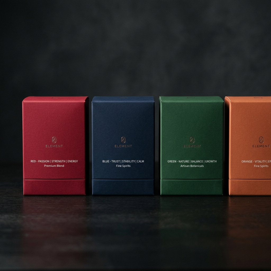
1. Red: Urgency, Passion, and Appetite
Red physically stimulates the body, raising nerve impulses and heart rate. It is the color of urgency and passion.
- Best used for: Food products (it stimulates appetite), clearance items, energy drinks, and brands targeting a bold, youthful demographic (e.g., Coca-Cola, Red Bull).
- Warning: Use red carefully in premium or relaxing products, as it can feel aggressive or cheap if overused.
2. Blue: Trust, Calm, and Professionalism
Blue is universally the most liked color. It evokes feelings of serenity, security, and intelligence.
- Best used for: Financial services, technology, healthcare, and bottled water. It communicates reliability (e.g., IBM, Oral-B).
- Warning: Blue is an appetite suppressant (there are very few blue foods in nature). Avoid using it as the dominant color for food packaging unless you are selling seafood or diet products.
3. Green: Nature, Health, and Wealth
Green is the easiest color for the human eye to process. It is intrinsically linked to nature, growth, and renewal.
- Best used for: Organic foods, eco-friendly products, health supplements, and financial products (e.g., Whole Foods, Starbucks).
- Warning: The shade of green matters immensely. Bright, neon green feels artificial and energetic, while muted, earthy green feels natural and organic.
4. Black: Luxury, Power, and Sophistication
Black absorbs all light. It is authoritative, timeless, and associated with high value.
- Best used for: Premium cosmetics, high-end electronics, luxury fashion, and "men's" products (e.g., Chanel, Apple packaging).
- Warning: Black can feel heavy or oppressive if not balanced with sufficient white space or striking metallic accents (like gold or silver foil).
5. Yellow: Happiness, Optimism, and Warning
Yellow is the most visible color from a distance. It captures attention immediately and evokes feelings of warmth and joy.
- Best used for: Children's toys, cheerful consumer goods, and products meant to evoke happiness or speed (e.g., McDonald's, Lego).
- Warning: Too much yellow can cause visual fatigue and anxiety. It is often best used as an accent color to draw attention to a specific call-to-action or new feature on the box.
6. White: Purity, Simplicity, and Cleanliness
White represents a blank slate. It is the ultimate color for minimalist design, conveying purity and modern elegance.
- Best used for: Skincare, medical products, Apple-style electronics, and high-end modern brands.
- Warning: Pure white packaging can sometimes look generic or unfinished if it lacks texture, embossing, or strong typographic contrast.
The Impact of Color Harmony
Choosing one color is just the beginning. Most packaging uses a palette of 2 to 4 colors. The relationship between these colors (Color Harmony) is what creates a cohesive design.
- Complementary Colors: Colors opposite each other on the color wheel (e.g., Blue and Orange). This creates high contrast and high energy. Perfect for sports products or children's items.
- Analogous Colors: Colors next to each other on the wheel (e.g., Green and Yellow-Green). This creates a harmonious, relaxing visual experience. Great for spa products or organic teas.
- Monochromatic: Different shades of a single color. This creates a very modern, sophisticated, and unified look.
Testing Your Packaging Colors
Never rely solely on your personal preference. What you like might not resonate with your target demographic. Before finalizing a packaging run, conduct A/B testing.
Create digital 3D renders of your packaging in different color palettes. Run a poll using a service like PickFu, asking your target audience: "Which of these products looks like it is the highest quality?" or "Which of these would you buy?" Let the data drive your decision.
Design Packaging That Sells Itself
Our packaging design experts understand the psychology of color, shape, and typography. Let D.Marketing create retail-ready packaging that commands attention and drives sales.
Start Your Packaging Project